请问有什么可以帮助您?

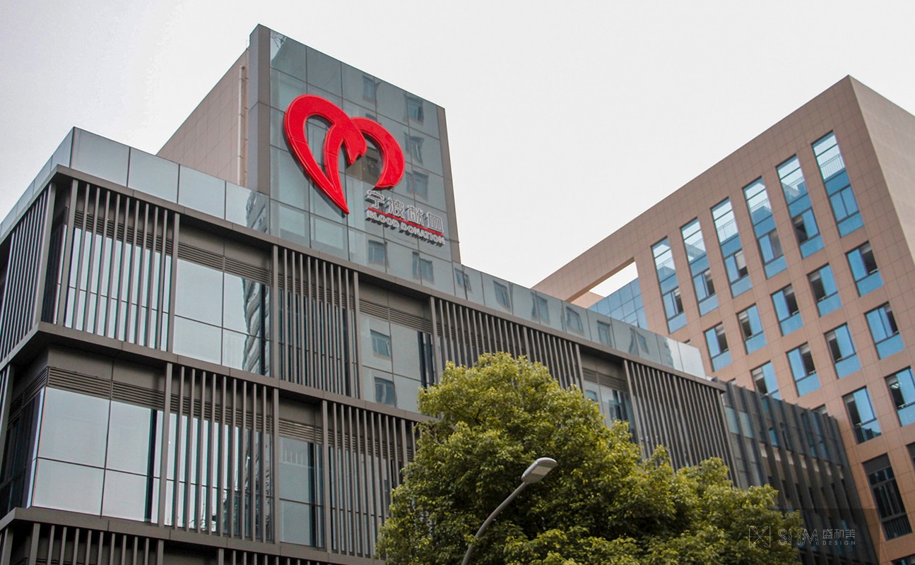
宁波中心血站
Ningbo central blood station
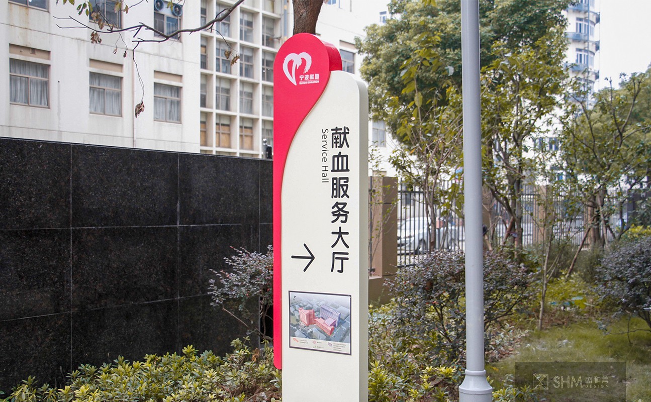
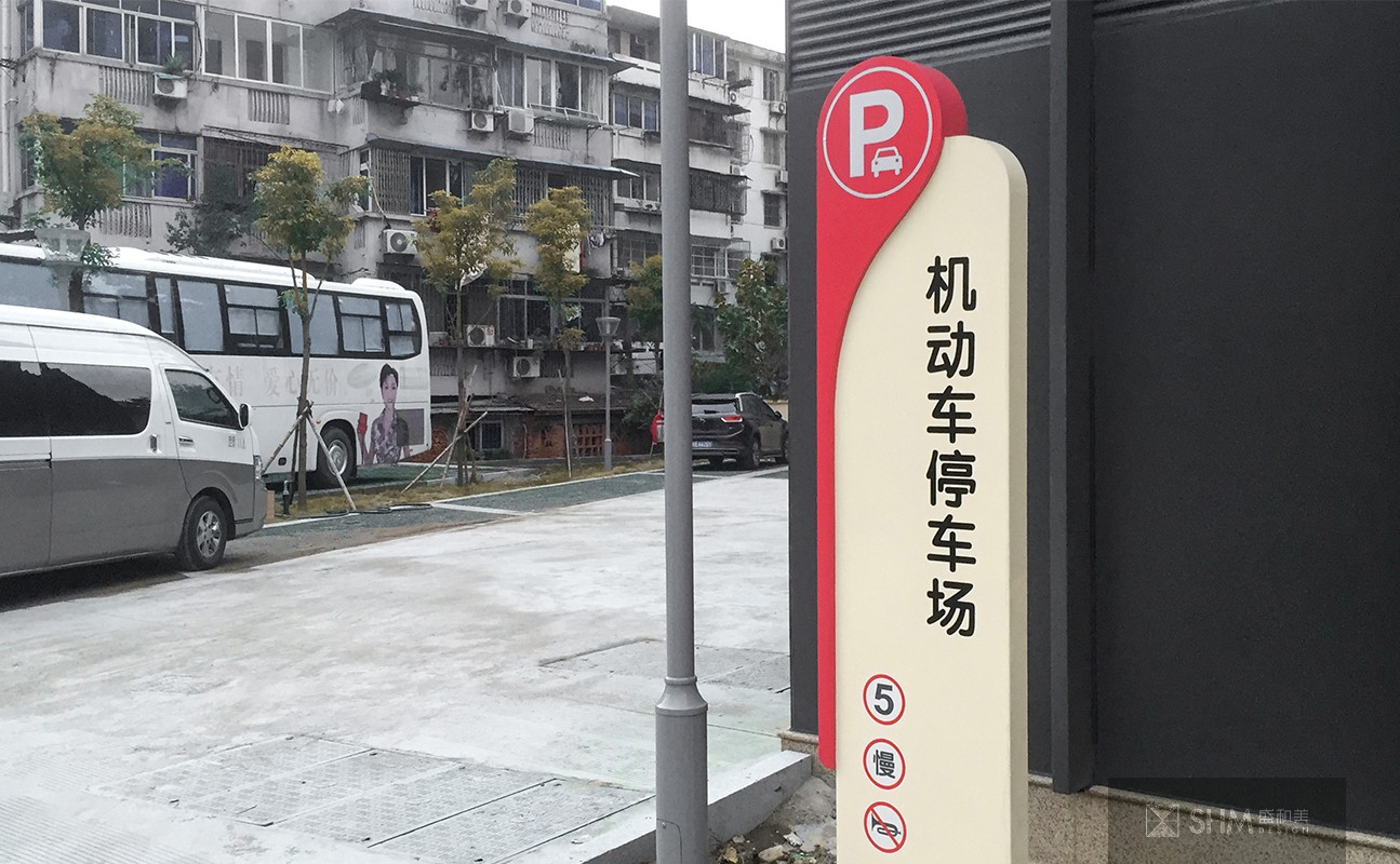
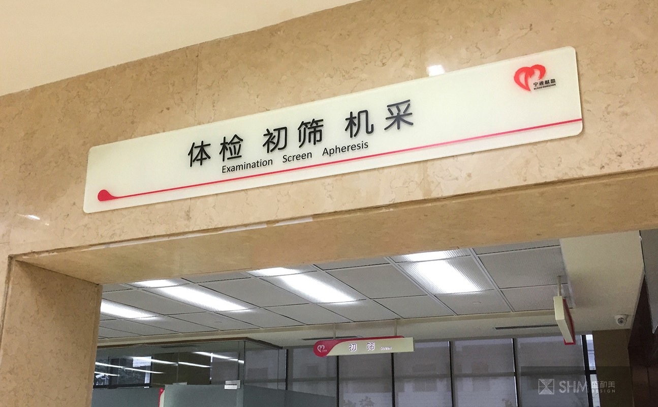
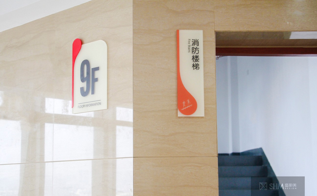
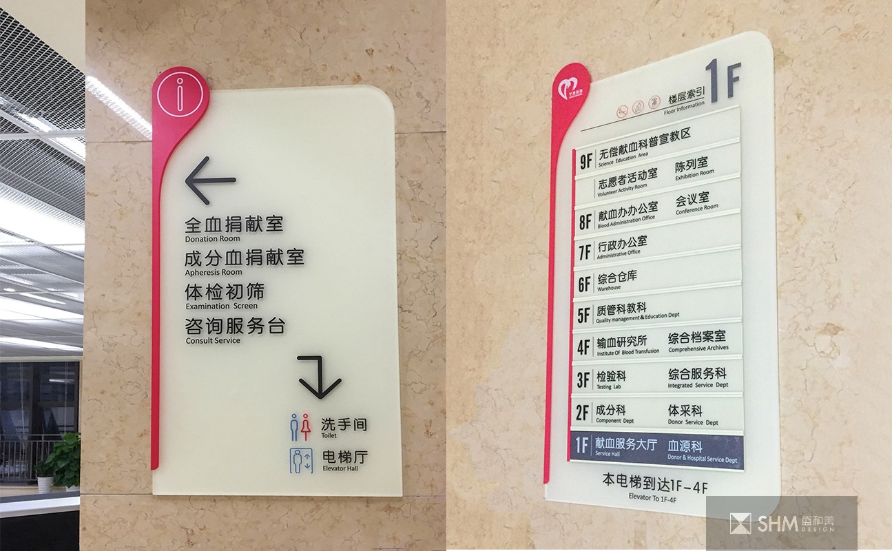
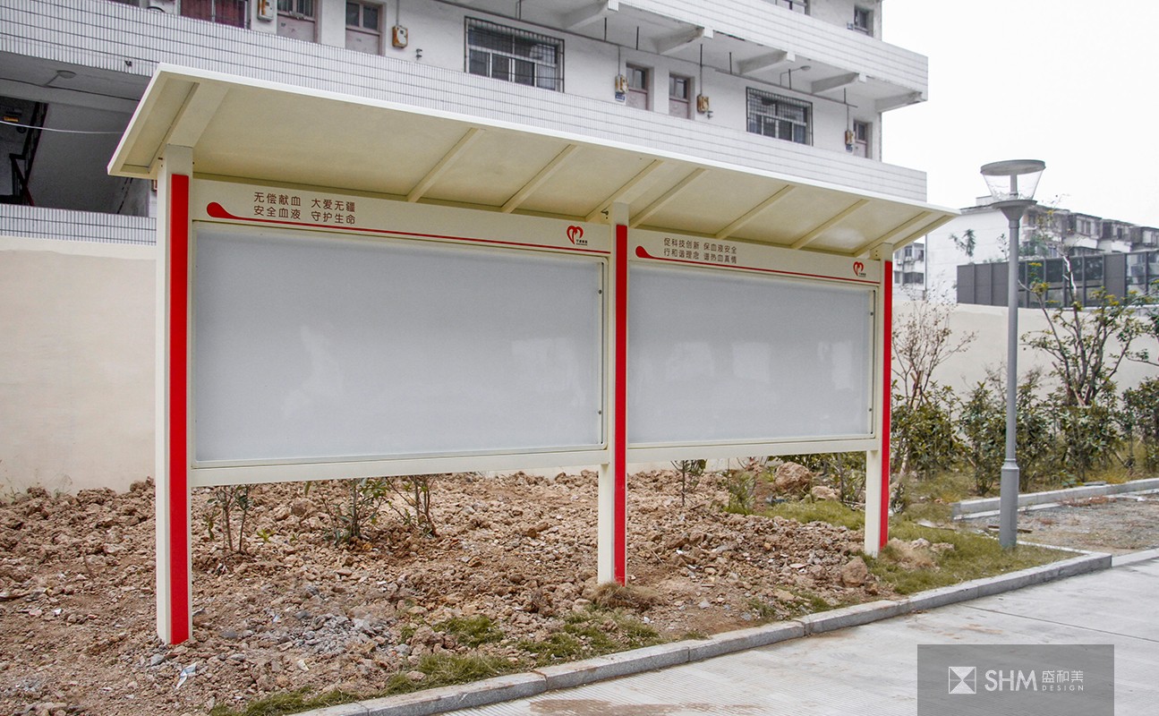
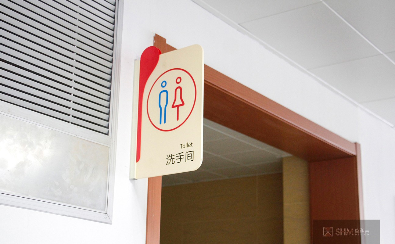
围绕血站医院这个比较鲜明的主题,我们在设计之初大胆的将“血滴”元素融入标识系统,材质以雾面磨砂亚克力,整体色调为米色加“血滴”色,既个性鲜明又温馨柔和,符合血站医院的行业特色,顾及使用者的畏惧心理,造型上不出现尖锐的棱角以及冰冷的感觉,让每个来献血的爱心人士都能感受到宁波中心血站的职业和温馨的氛围。
Focusing on the distinct theme of blood station hospital, we boldly integrated the "blood drop" element into the logo system at the beginning of design. The material is matte acrylic, and the overall color is beige plus "blood drop". It is distinctive, warm and soft, in line with the industry characteristics of blood station hospital, taking into account the user's fear, and there is no sharp edges and corners and cold feeling in the modeling Feel that everyone who comes to donate blood can feel the occupation and warm atmosphere of Ningbo central blood station.

扫码关注盛和美公众平台