请问有什么可以帮助您?
大陈岛导视标识设计
Da Chen Dao
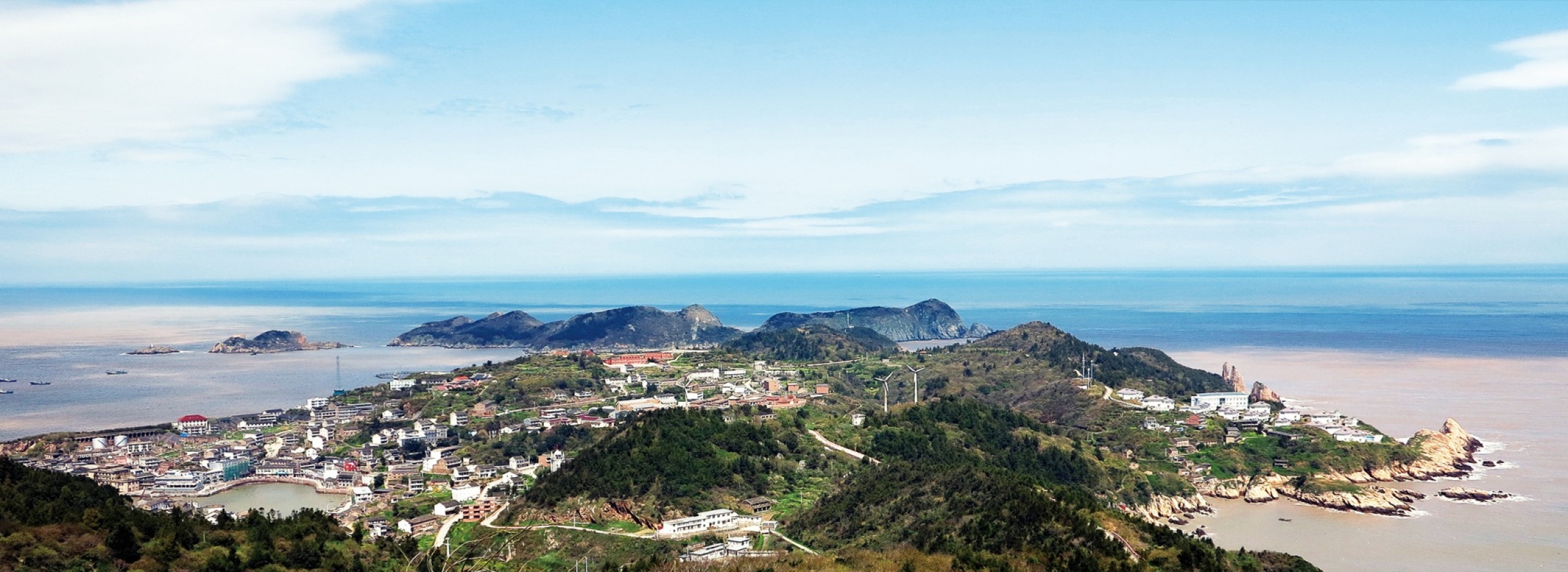
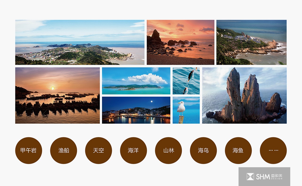
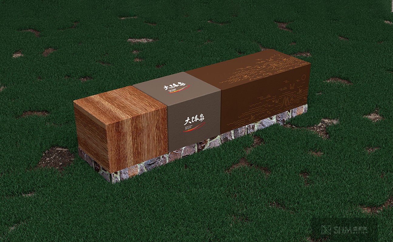
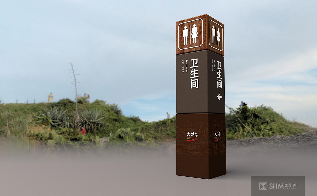
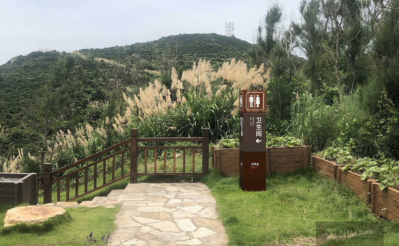
大陈岛地处海岛地区,森林覆盖率达50-60%,为省级海上森林公园。设计过程中要考虑对当地环境的保护与适当利用,还需要考虑台风、湿气、海水等自然因素带来的影响。
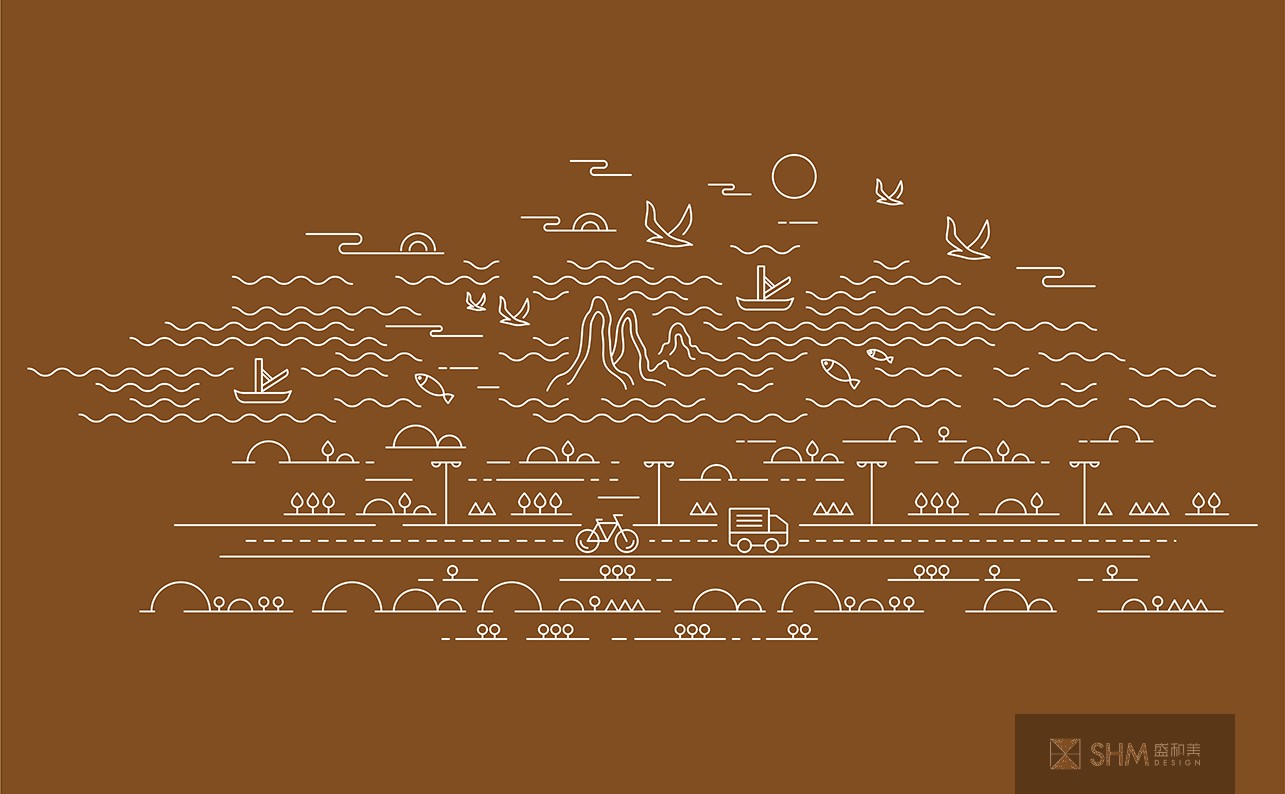
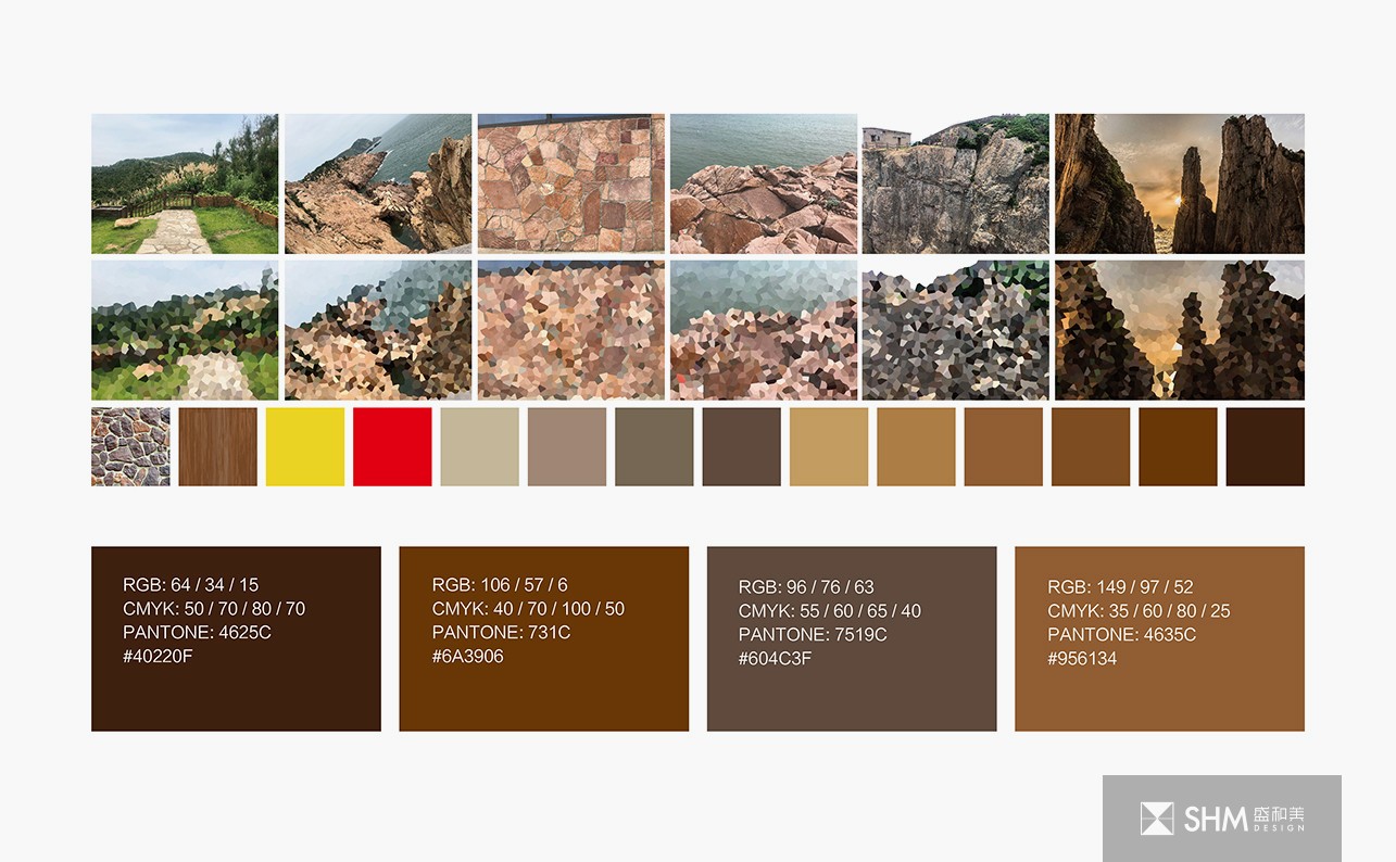
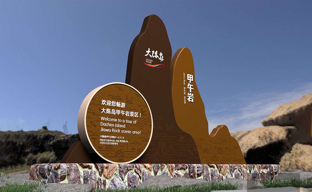
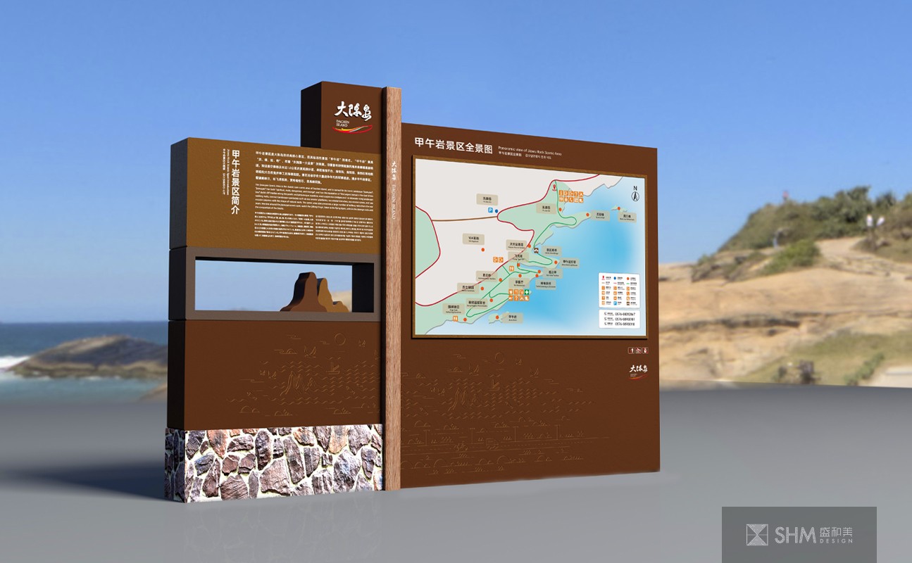
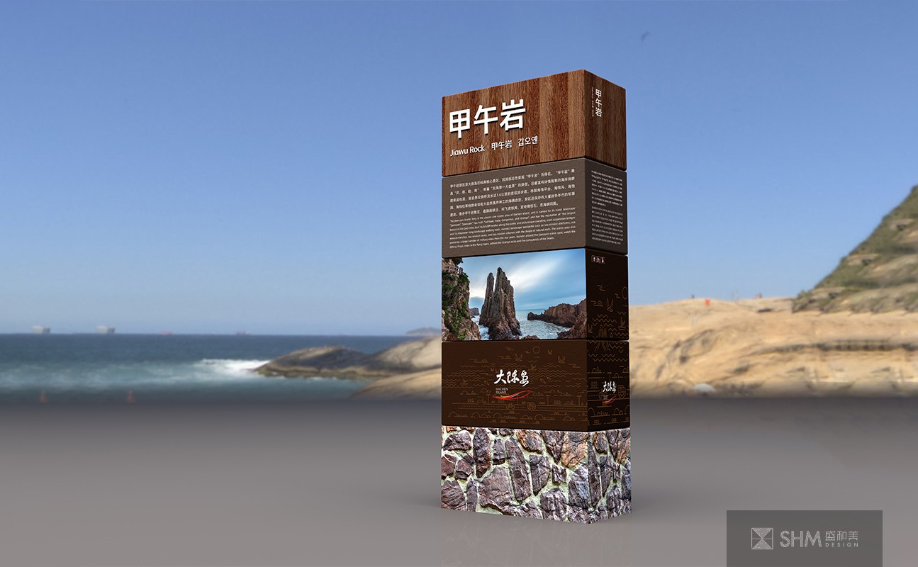
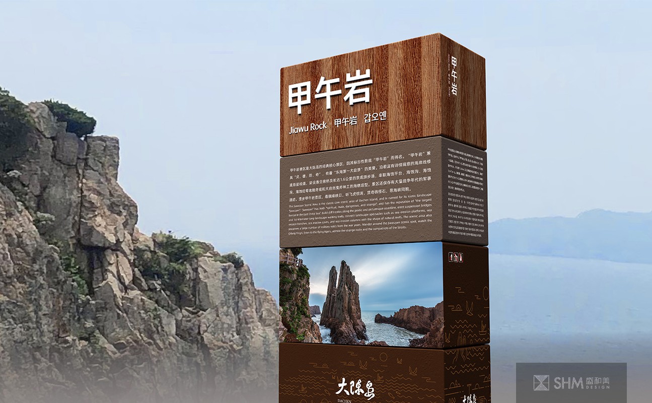
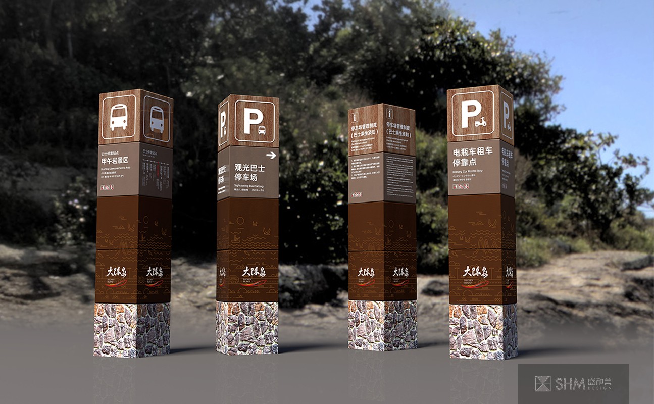
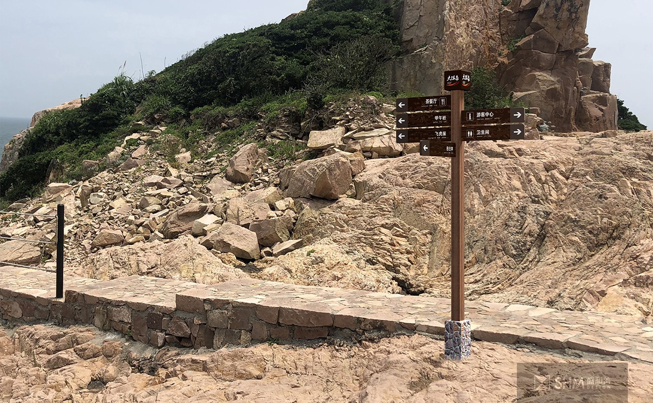
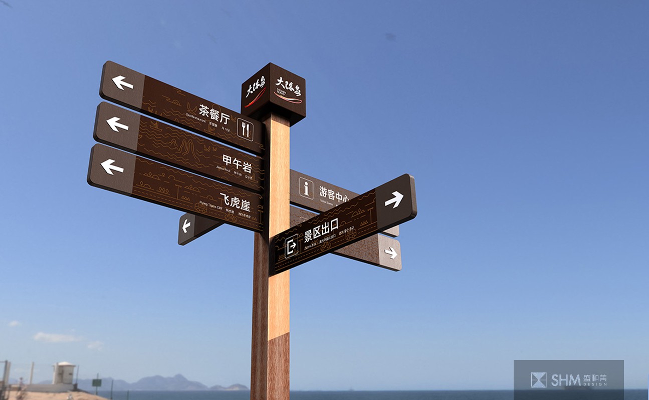
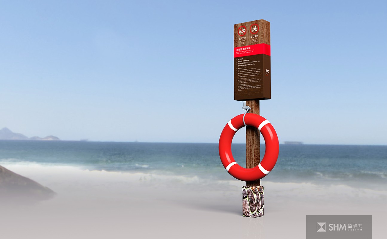
基于大陈岛当地特色元素及文化,设计时充分考虑了与环境的协调性,牌体造型采用简单大气的方形,看起来稳重,与淳朴自然的民风相呼应,也能有一定的稳定性。色彩上为了防止导视色彩明度与环境相近过于融合不易识别,所以选用了深棕色为主色调,既和谐又凸显,同时衍生出不同明度的棕色作为辅助色应用,以及用红色和黄色作为警示用色彩。为了让导视与环境更为融合,我们增选了木纹理融入导视,同时加入了大陈岛特有的石材作为点缀,以其特有的色相接近棕色但明度不规律的颜色,增加导视色彩的变化性,使得导视和谐、自然、有趣。
Dachen Island is located in an island area with a forest coverage rate of 50-60%. It is a provincial Marine forest park. In the design process, the protection and proper utilization of the local environment should be considered, as well as the impact of natural factors such as typhoon, moisture and sea water.
Based on the local characteristic elements and culture of Dachen Island, the design fully considers the coordination with the environment. The brand body adopts the simple and atmospheric square shape, which looks stable and echoes the simple and natural folk customs, and can also have a certain stability. Color in order to prevent the guide color lightness and the environment is too close to the fusion is not easy to identify, so the use of dark brown as the main color, both harmonious and prominent, at the same time derived from different lightness of brown as an auxiliary color application, and red and yellow as a warning color.
In order to make the guide and the environment more integrated, we added the wood texture into the guide, while adding the da Chen Island unique stone as an ornament, with its unique color close to brown but irregular lightness of the color, increase the change of the guide color, making the guide harmonious, natural, interesting.


扫码关注盛和美公众平台