请问有什么可以帮助您?
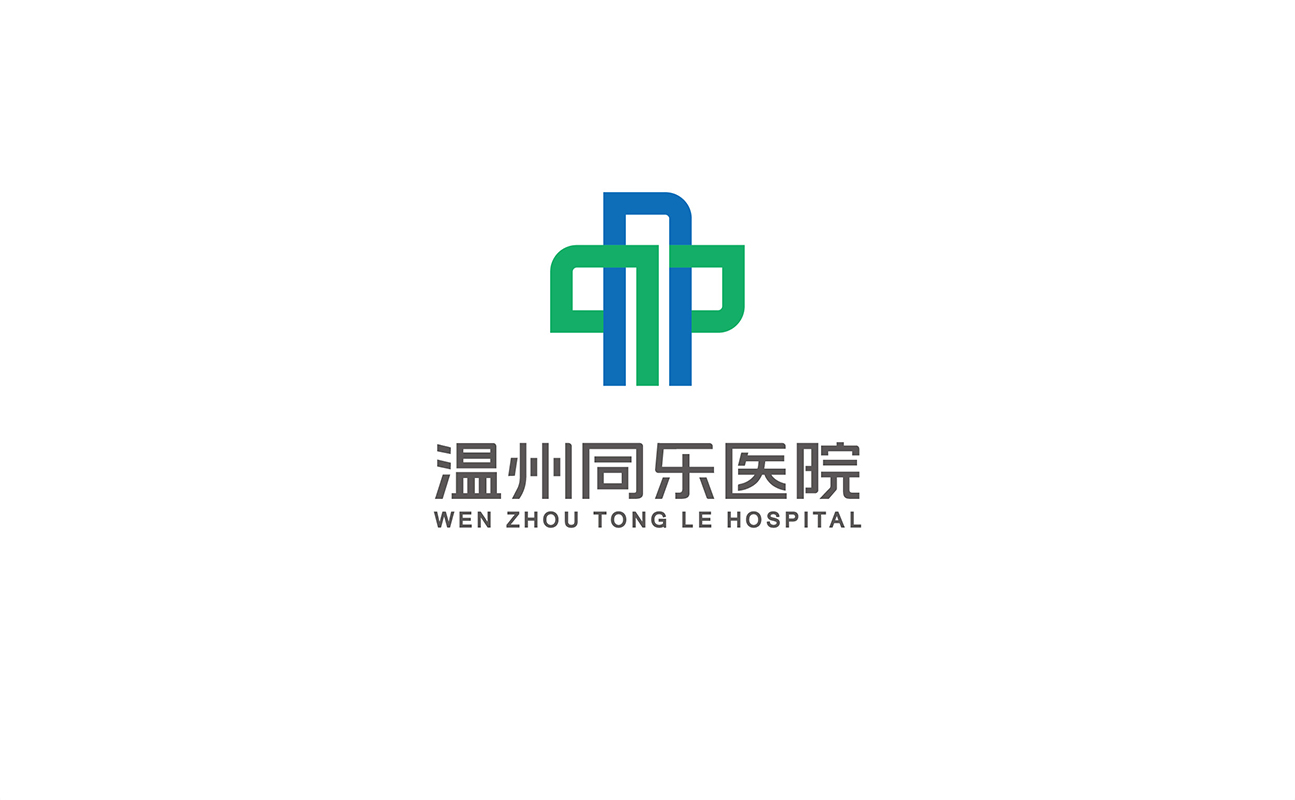
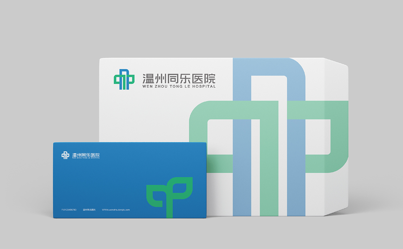
温州同乐医院
WEN ZHOU TONG LE HOSPITAL
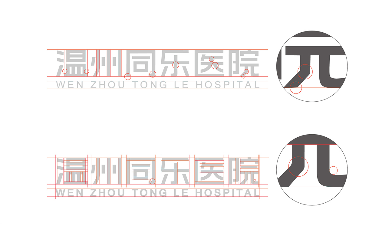
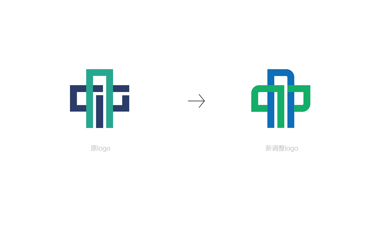
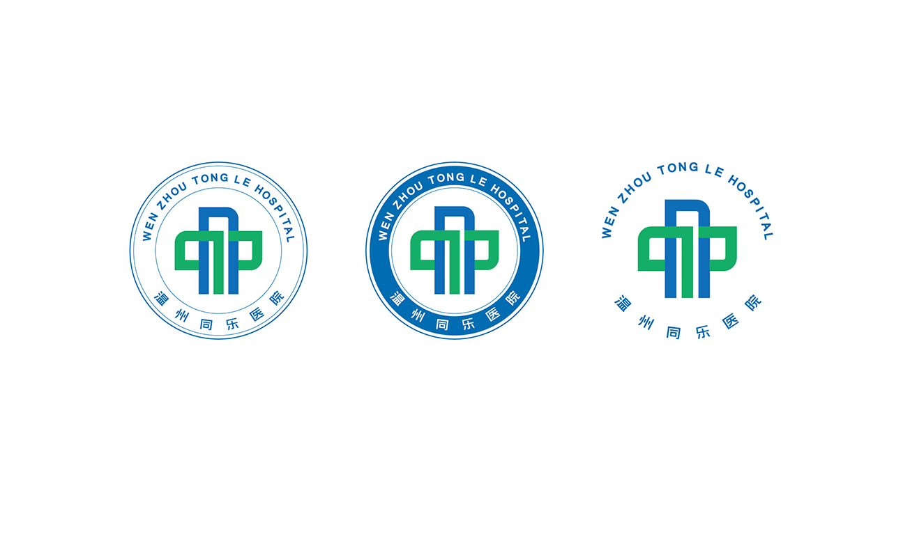
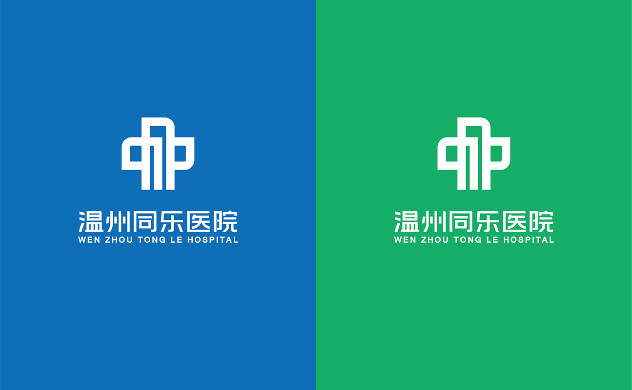
温州同乐医院LOGO经优化后,采用明快的蓝绿色调,结构整体而协调。图形部分融入倒角处理,视觉柔和且传递安全感。绿色形态既如字母“T”代表“同乐”,又似新生绿芽,寓意生命向上、康复有望,也象征医院持续发展的活力。中文字体经专业制图优化,英文字体适度加粗,中英文组合疏密得当,呈现和谐统一的视觉形象。
After optimization, the LOGO of Wenzhou Tongle Hospital adopts bright cyan and green tones with an integrated and coordinated structure. The graphic part incorporates chamfered processing, delivering a soft visual effect and a sense of security. The green shape not only resembles the letter "T" (standing for "Tongle"), but also looks like a new green shoot. It implies the upward power of life and the hope of recovery, as well as symbolizes the vitality of the hospital’s sustainable development. The Chinese font has been optimized through professional graphic design, while the English font is appropriately bolded. The Chinese and English characters are combined with well-balanced spacing, presenting a harmonious and unified visual image.
扫码关注盛和美公众平台