请问有什么可以帮助您?
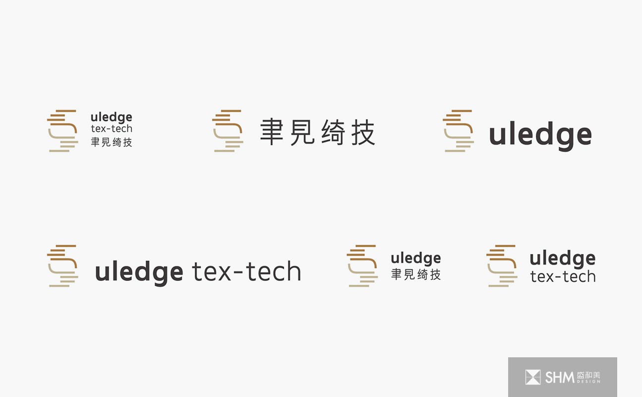
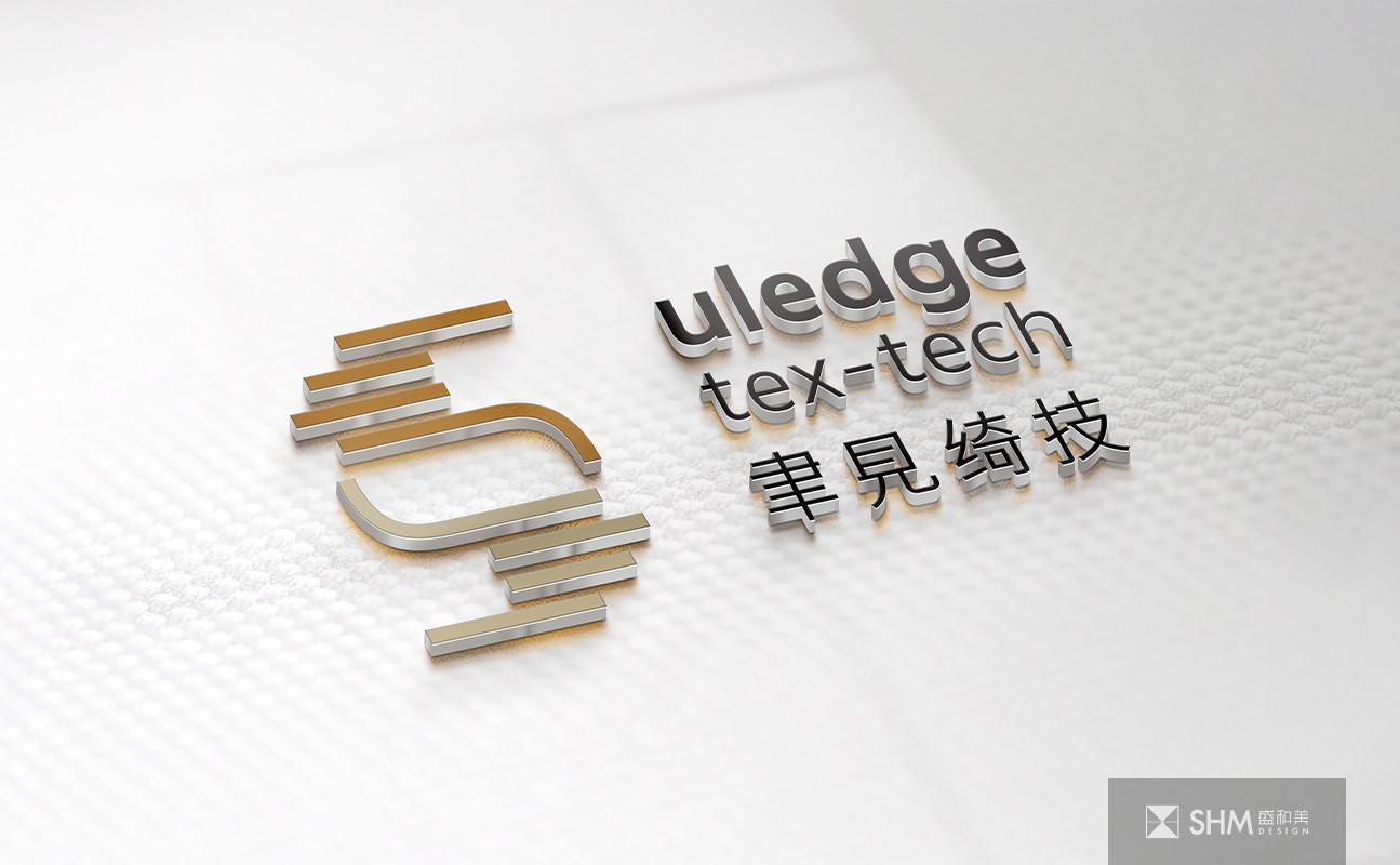
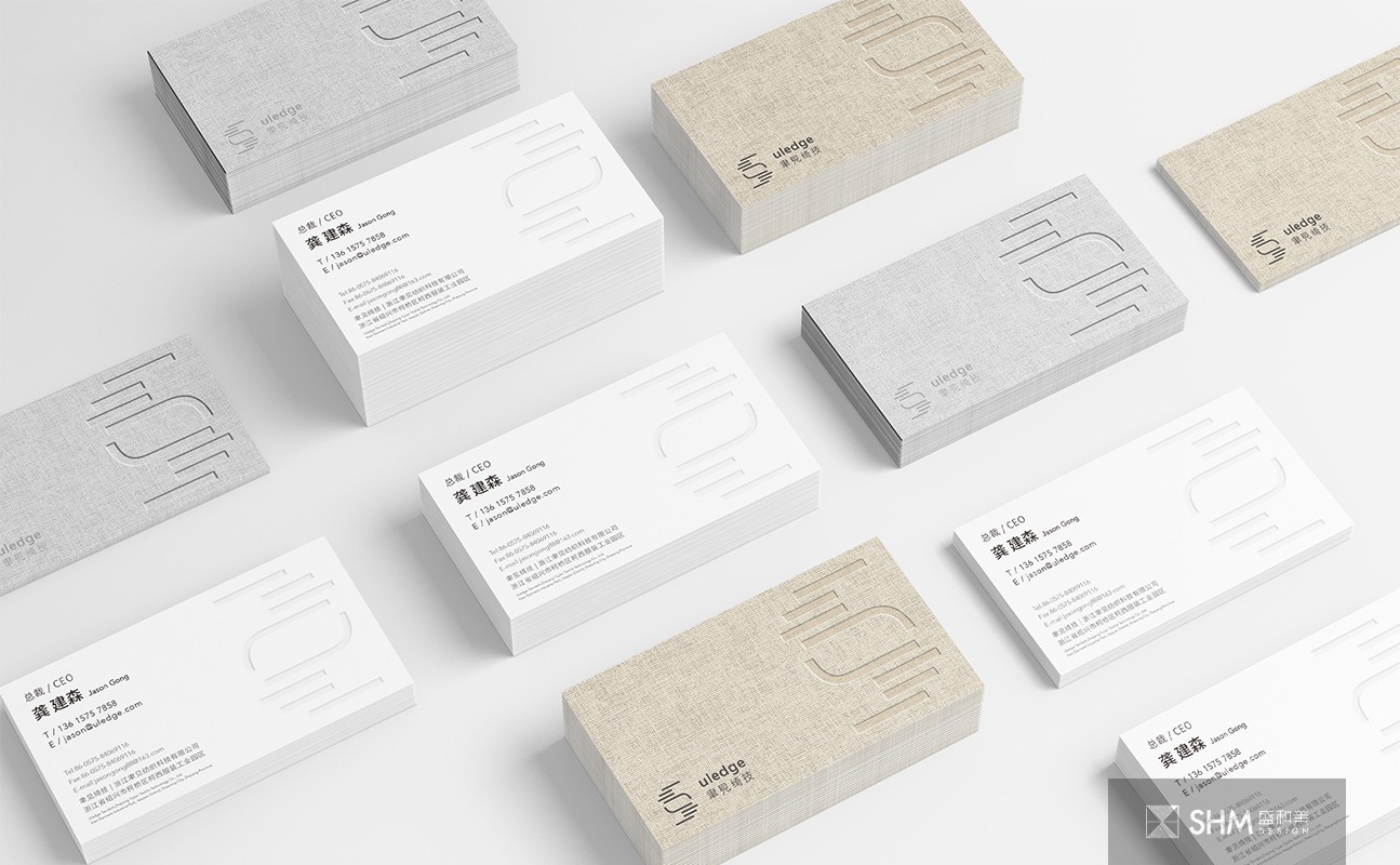
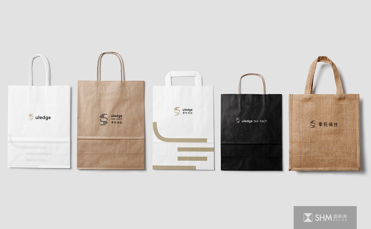
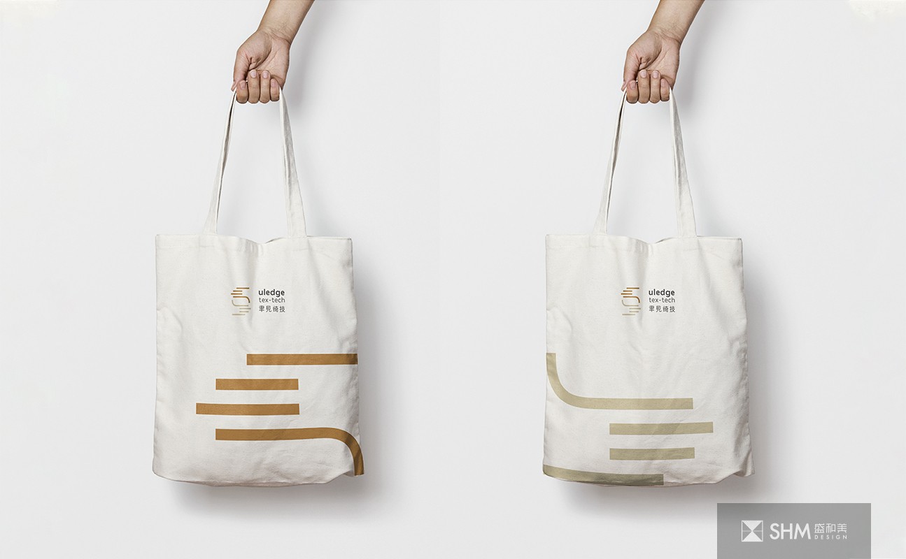
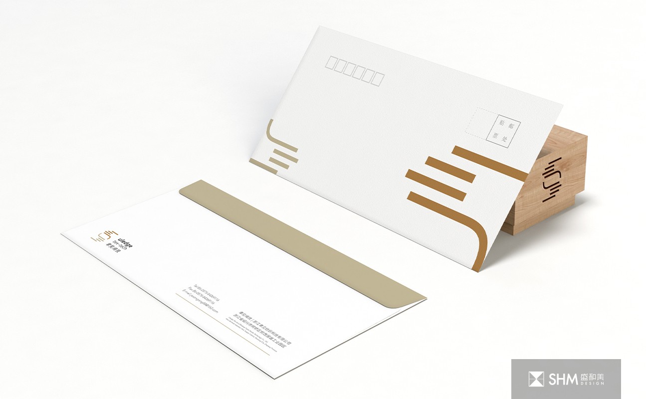
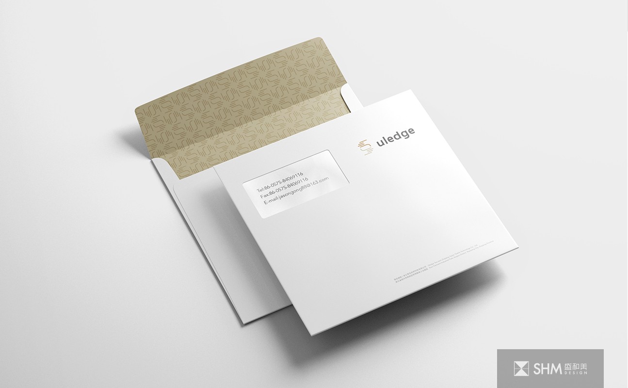
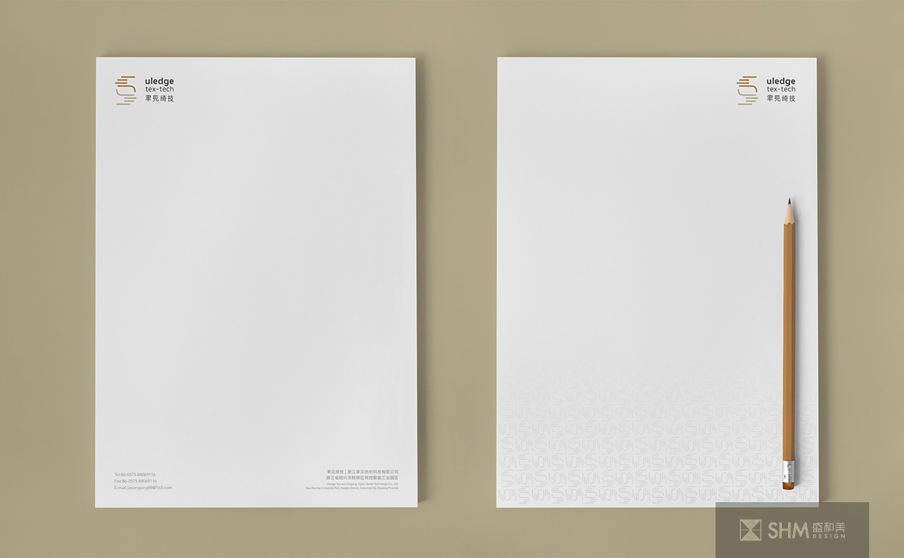
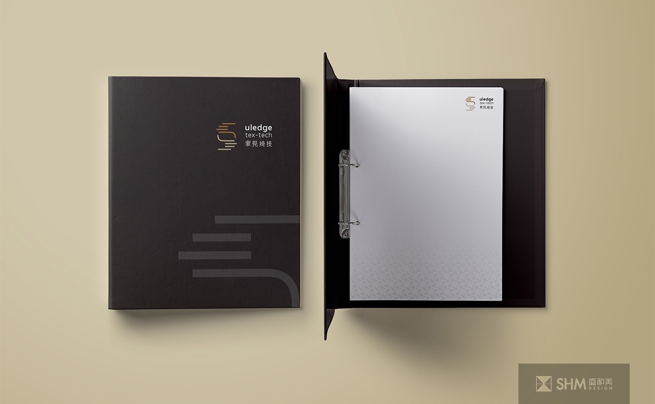
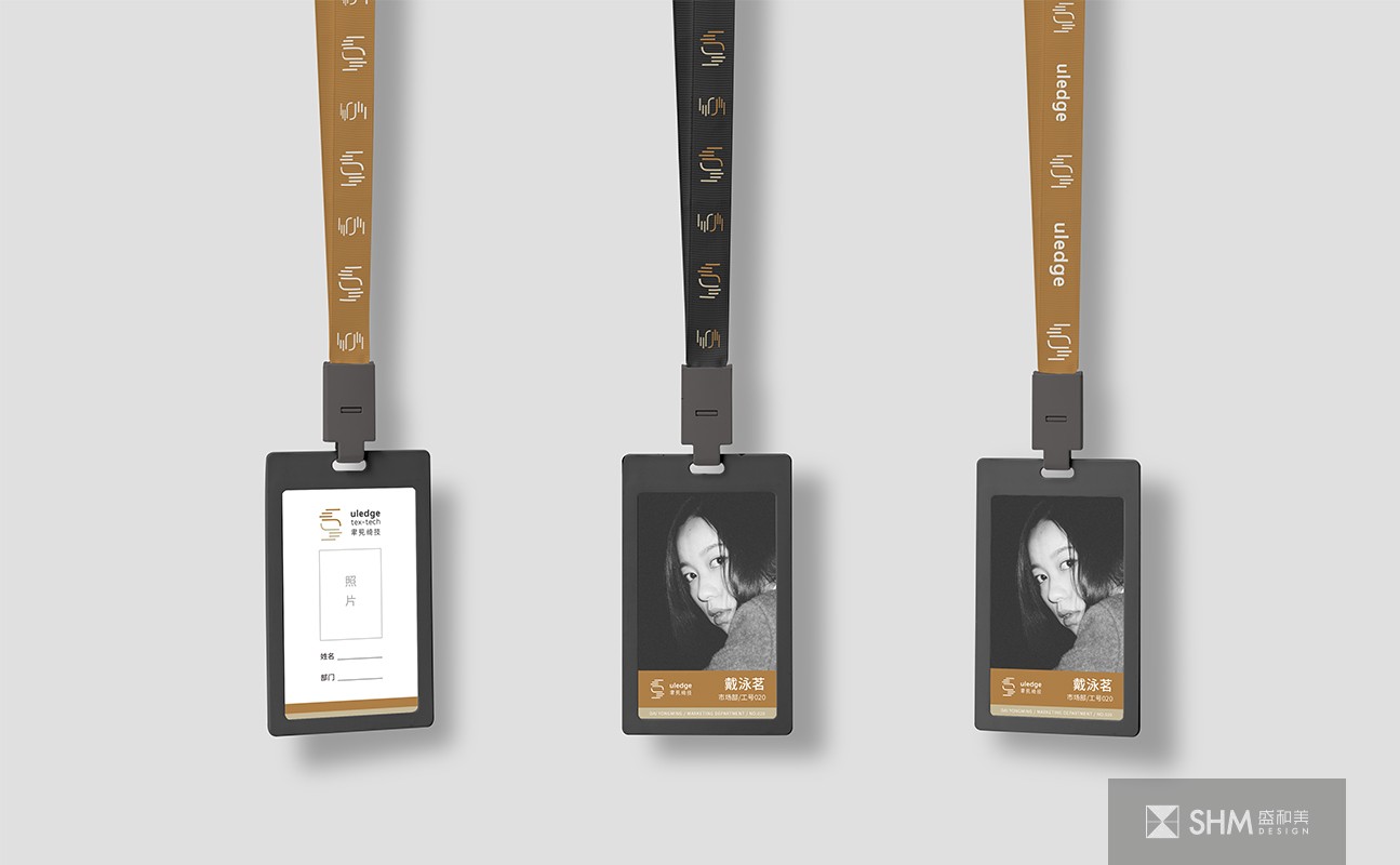
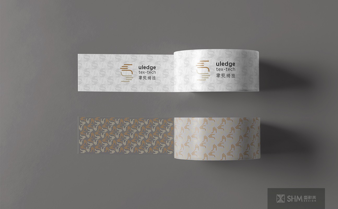
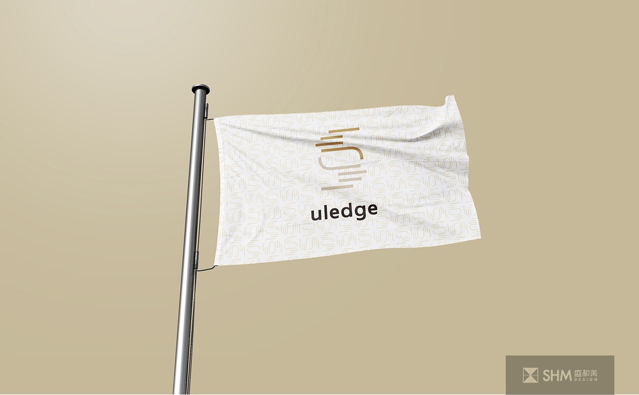
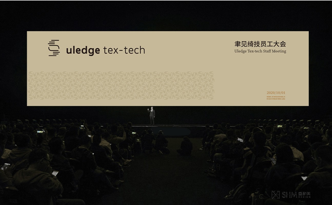
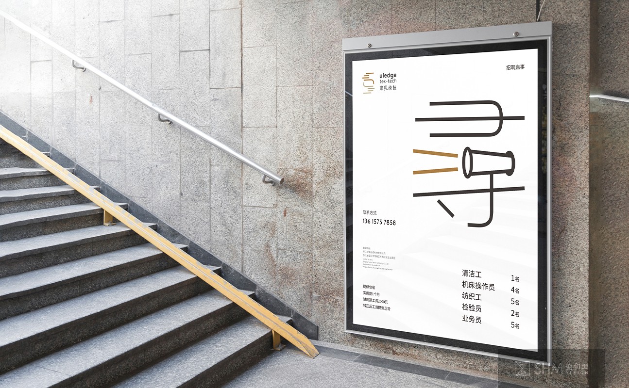
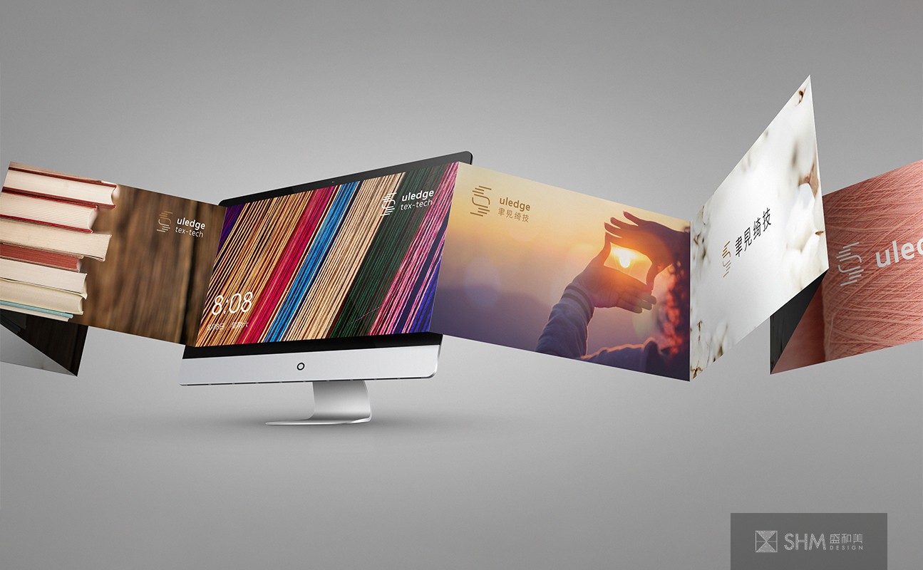
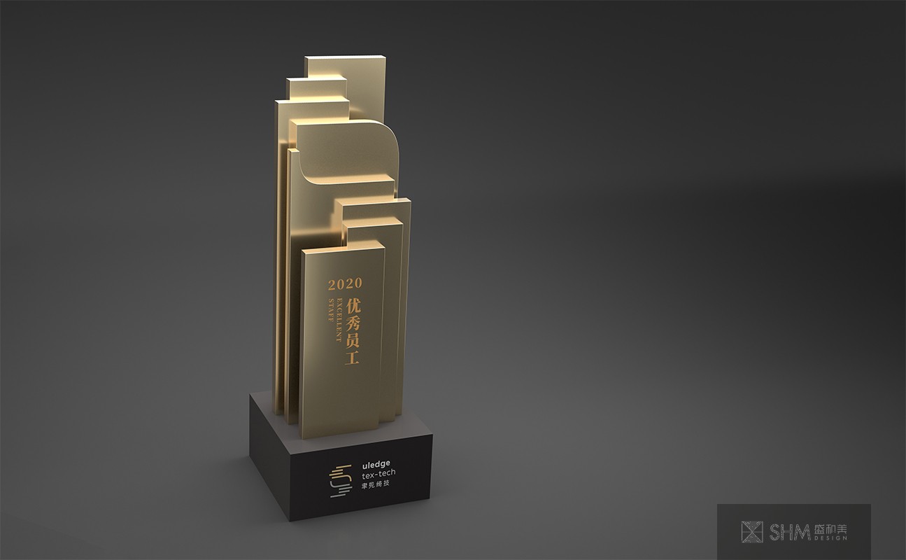
聿见绮技
uledge tex-tech
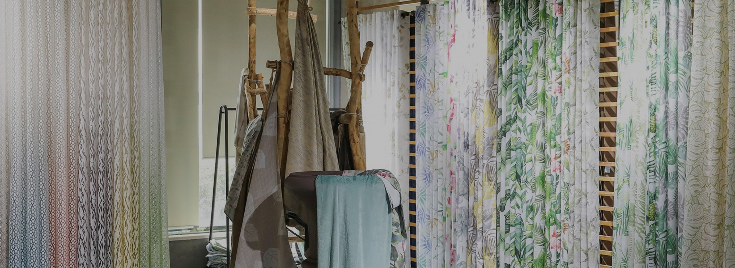
公司位于柯桥区柯西服装工业园区,紧邻104国道,离柯桥轻纺城仅几分钟车程,地理位置十分优越。公司主要生产窗帘、靠垫、床上用品等,产品远销欧美各国。自成立来,公司坚持走“以市场为导向,不断自主创新”的发展之路。
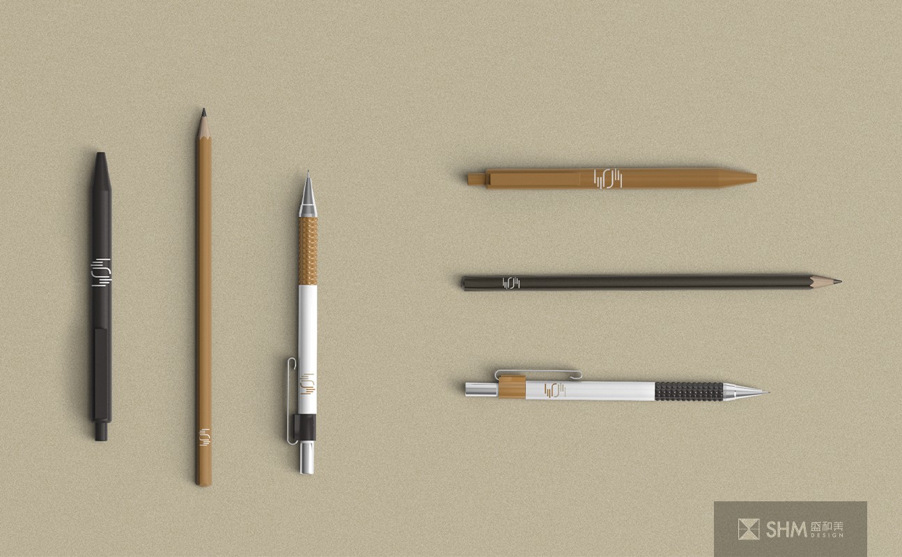
整个VI围绕着双手取景,构成企业标志的设计灵感,具有多重含义:一是代表聚焦、专注,是一种美学手势;二是代表了手和眼,象征实干和远见;三是仿佛转动的纺织梭子,既代表了聿见绮技纺织的特性,又有互动交互、信息流的现代含义。一手向过去,一手向未来,源远流长。色彩上采用两种不同的棕色, 棕色常被联想到泥土、大地、自然、简朴,给人可靠、有益健康的感觉。
The company is located in Kexi Garment Industrial Park, Keqiao District, close to 104 national Road, only a few minutes drive from Keqiao textile City, the geographical position is very superior. The company mainly produces curtain, cushion, bedding and so on, the products are exported to Europe and America.
The whole VI revolves around both hands, forming the design inspiration of the corporate logo, with multiple meanings: one is on behalf of focus, concentration, is an aesthetic gesture; The second is to represent the hand and eye, a symbol of practical and far-sighted; The third is the spinning shuttle, which not only represents the characteristics of lut see excellent textile technology, but also has the modern meaning of interactive interaction and information flow. One hand to the past, the other hand to the future, a long history. Two different brown colors are used. Brown is often associated with earth, earth, nature, simplicity, and gives people a feeling of reliability and good health.
扫码关注盛和美公众平台